Designing Believable Worlds: Visual Identity for Games that Actually Makes Sense
- Jul 31, 2025
- 3 min read
Updated: Aug 6, 2025
When building a world for a game or a story, it's easy to focus on lore, mechanics, or environments. But visual identity is what makes those things feel lived in. It’s not just about a logo or a UI. What do your characters wear? What stores do they visit? What kind of coffee cups do they hold when they're out and about? Good branding makes your world feel real. It helps the player get immersed. Bad branding? It reminds us we’re just looking at pixels. In this article, I'll be talking about how visual identity, through logos, symbols, and design language, can either deepen a game world's immersion or completely break it. It'll be a relatively short read.
I was watching the Marathon reveal cinematic short, written and directed by Alberto Mielgo, with my friends. We were blown away by how technically impressive the visual design elements were. At first glance, we liked it all. Characters wear brutalist, techwear-inspired outfits, and there are logos splashed across crates, water tanks, and vehicles in the background. But as we kept watching, the question we started to ask ourselves was: who is this design for? These logos appear as if they're part of a bustling commercial world. But that world doesn’t exist. There’s no in-universe logic for corporate identities to be so visible in what’s presented as a derelict, uninhabited facility. The result? Branding that might look great in a designer’s portfolio, but feels like noise inside the game itself.
Now contrast that with WipEout, a futuristic racing game where branding enhances immersion. Of course the ships are covered in sponsor logos. This is a sport with teams, spectators, and leagues. You expect marketing to exist. The design fits the fiction. Branding here isn’t decorative—it’s necessary worldbuilding.

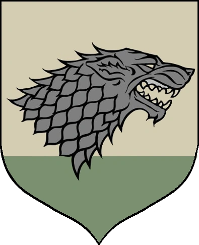
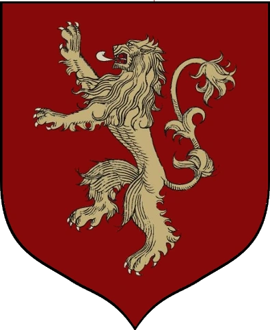
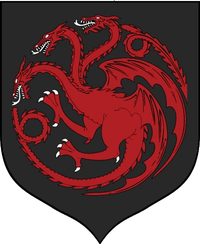
And this doesn’t only apply to sci-fi settings or corporate logos. In fantasy, sword-and-sorcery, or mythic worlds, the same principles hold. If a kingdom has a crest, does that symbol reflect its values? Think of the great houses in Game of Thrones: House Stark’s direwolf evokes their loyalty, resilience, and Northern harshness. House Baratheon’s stag symbolizes strength and nobility, but also a kind of wild instability. These banners don’t just identify factions. They tell you what kind of people the members of their house are.

You can also take The Legend of Zelda: the Triforce isn’t just a decorative motif: it’s a symbol of divine balance, echoed across temples, items, and characters. Each goddess, Din, Nayru, and Farore, has a distinct symbol that reinforces her role in the world’s cosmology. These elements aren’t just consistent. They deepen the meaning of the world and guide the player’s understanding of it.


So whether it’s futuristic branding or arcane symbolism, visual design must serve the fiction. When it doesn’t, it breaks immersion. When it does, it tells stories without needing words.
When visual identity is done right, it reinforces everything your game world wants to say. It gives weight to environments, logic to your UI, and believability to your characters. But when it's out of sync, when branding exists only to “look cool”? It becomes a distraction.
Game design is storytelling. Design is part of that story. So ask yourself: would your character really see that logo, symbol or insignia there? Would it even exist? If you're building a game and want your world to feel as believable as it is beautiful, let's talk. I specialize in visual identity that fits—branding with purpose, not just decoration.
Comments